A WEB DESIGNER
BASED IN
JAPAN.
Currently Based In Australia,
I'm Enthusiasticly Looking For
The Oppoturnity To Work Diverse
I NEVER STOP LEARNING
HUMILITY
I'M HERE TO TELL YOUR STORY
BELIEVE THE POWER OF
DESIGN × TECHNOLOGY
SIMPLISTICS AND CREATIVITY
LOVE
ANIMALS,
TRAVEL,
NATURE


SKILLS
- HTML
- CSS
- JAVASCRIPT
- DESIGN
- PHOTOSHOP
- ADOBE XD
- DREAM WEAVER
- WORD PRESS
- FIGMA
- JAPANESE
- ENGLISH
- PASSION
Hi there!
My name is Aomi Takizawa
Born in 1997, Currently live in TOKYO, JAPAN
MY INTERESTS
Design theory,Color theory,photography, graphic art, css animation, Typography,
Design×Art×Tec, simplistics, classic, film camera,80vibes,trendy
WHY SO?
I loved drawing when I was a little kid. Since then my interests towarded graphics,
Music,Fashion,Art. But the one thing in common was all of them inquire creativity and designing.
And I realised I wanted to develop my technology skill as I studyed how important it is in this modern world.
More I kept learnig web design more I got stimulated by the power of technology.
I wanna be a great designer who can make our imagination possible with IT skills
I'LL WORK ON MORE
I would work on to have a deeper understanding of color theme , spacing , typography.
I assure aquiring higner animation skill with cording beside
any other creative skills (such as photography, Graphic art, 3D animation)
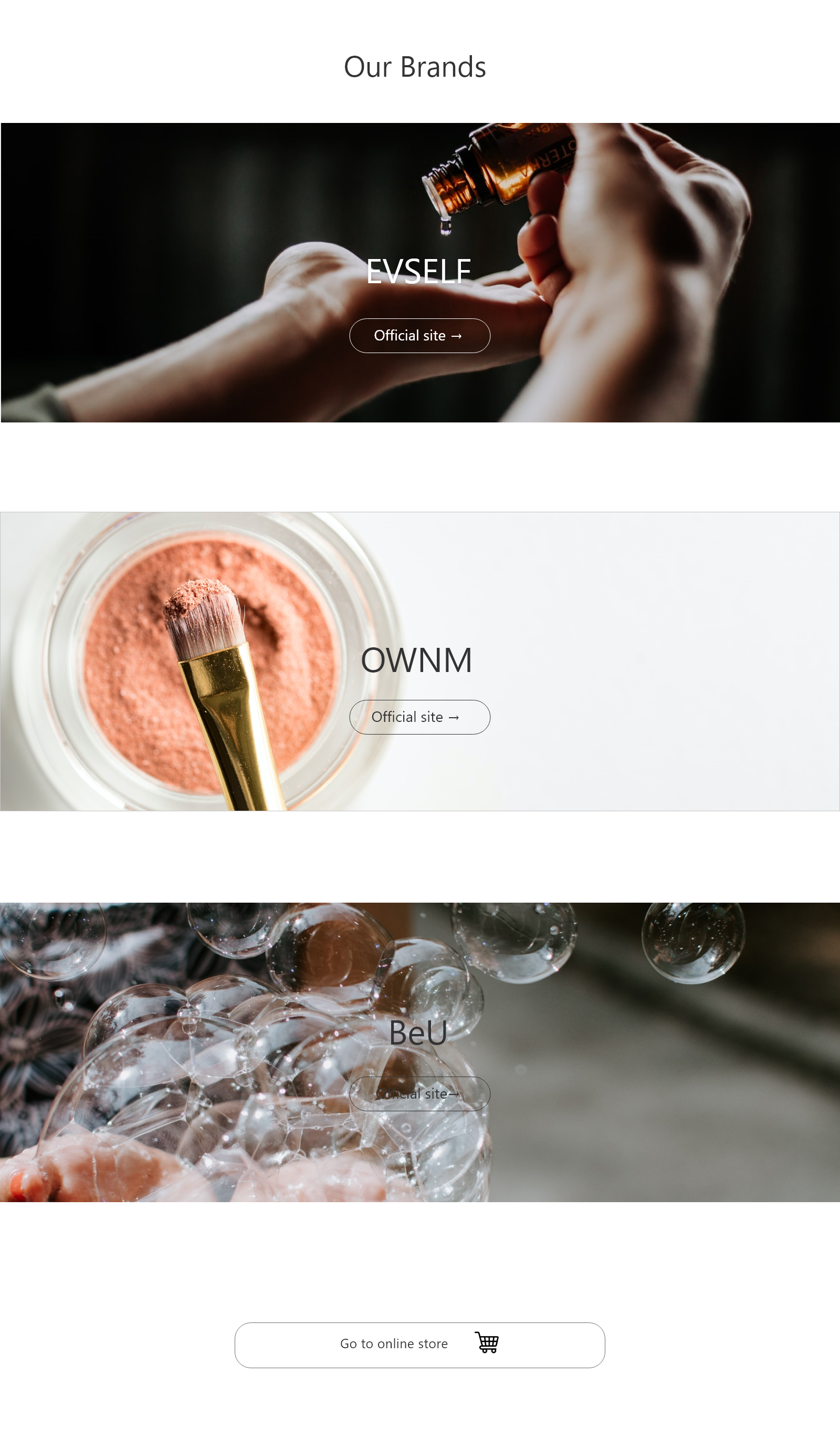
- HERE'S MY WORKS
- HERE'S MY WORKS
- HERE'S MY WORKS
- HERE'S MY WORKS
- HERE'S MY WORKS
- HERE'S MY WORKS
- HERE'S MY WORKS
- HERE'S MY WORKS
- HERE'S MY WORKS
- HERE'S MY WORKS
- HERE'S MY WORKS
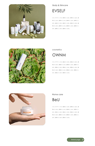

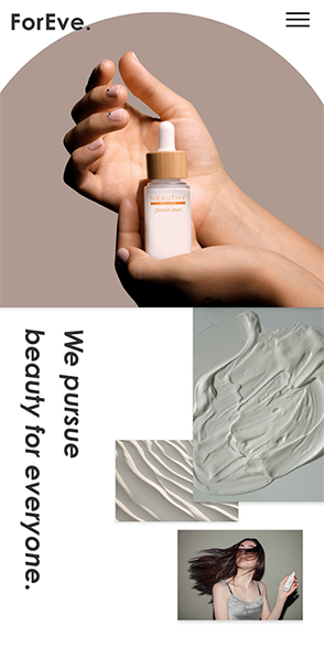

FOR EVE.
BEAUTY BRAND WEB SITE
Process
I have designed and created a brand website for a cosmetics company that embodies the themes of “gender-neutral” and “inclusiveness”. To align with the brand’s values, I selected colors that compliment all skin tones, genders, and age groups. Through the blend of cool and warm tones, I purposefully wanted to convey the message that people’s differences become blurred and unified when they feel beautiful. As this brand is also recognized for its use of natural ingredients, the design is fused with peachy and earthy tones to reflect the organic products.
Subject
In order to illustrate simple and natural images, I ensured not to include harsh details or gimmicks, and carefully maintained clean margins and spacing. In addition to this, I intently created clear contrasts between the size of characters.
Result
I believe I captured the brand’s essence with my design. Through this project, I realized the complexities of working with empty spaces to create effect. I think it would be great to explore further into the size and characteristics of the text.
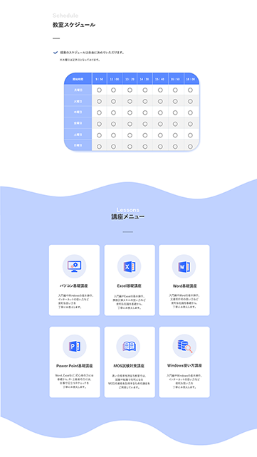
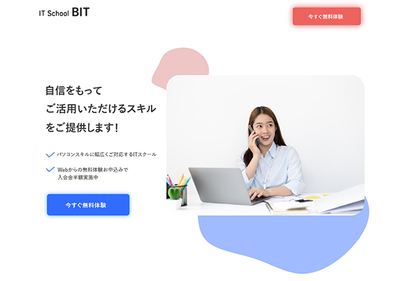

BIT
IT SCHOOL LANDING PAGE
Process
I have designed and created a landing page for a IT school company. I set a goal to put a lot of animation this time and picked neon blue and red as a color theme to make the impact digital and smart. Moreover,I worked on high usebility.
Subject
Because this is a landing page I tried to make it digital and not too trendy. And one of the task was to design a landing page that is possible to find infomation user want quickly and easy. Also, I wanted to put effort to all of button and navigations Instantly understandable.
Result
I made it possible to makea good ambiance to reminds IT industry by choosing neon color as a color scheme.And as I organised a lot of discription that company wants to put, I combinated it with a lot of animaiton just to make the infomation easier to read and lead the line of sight.
WILL BE MORE SOON...